


IMHO I think that as far as fonts go the simple 'clean cut' look is possibly the best way to go, rather than the 'handwriting ' style. That's only my opinion though, but is based on the 'it's easier to read theory. I'm one of those people that only glances at stuff and if it doesn't hit me immediately, I tend to ignore it and I know I'm not the only one who thinks that way. We have a local newspaper here in Sheffield called 'The Mercury' and in it's early days they would use every font available to man, which made the advertisments for venues & gigs virtually unreadable. Just my thoughts, thanks for taking time to do them and keep up the good work.
To those who have submitted 'Banner Designs'
1 post
• Page 1 of 1
To those who have submitted 'Banner Designs'
![]() by dave robinson » 25 Sep 2009, 00:51
by dave robinson » 25 Sep 2009, 00:51
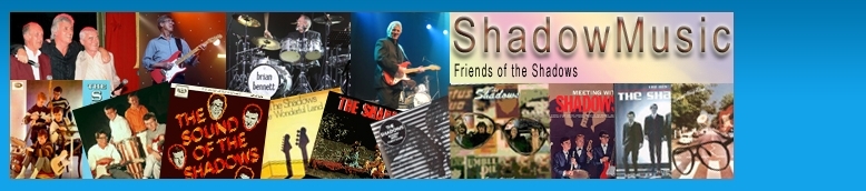
Can I just say that I have had another look at these splendid banners that you guys have been producing and that every one of them has a certain appeal.
IMHO I think that as far as fonts go the simple 'clean cut' look is possibly the best way to go, rather than the 'handwriting ' style. That's only my opinion though, but is based on the 'it's easier to read theory. I'm one of those people that only glances at stuff and if it doesn't hit me immediately, I tend to ignore it and I know I'm not the only one who thinks that way. We have a local newspaper here in Sheffield called 'The Mercury' and in it's early days they would use every font available to man, which made the advertisments for venues & gigs virtually unreadable. Just my thoughts, thanks for taking time to do them and keep up the good work.
IMHO I think that as far as fonts go the simple 'clean cut' look is possibly the best way to go, rather than the 'handwriting ' style. That's only my opinion though, but is based on the 'it's easier to read theory. I'm one of those people that only glances at stuff and if it doesn't hit me immediately, I tend to ignore it and I know I'm not the only one who thinks that way. We have a local newspaper here in Sheffield called 'The Mercury' and in it's early days they would use every font available to man, which made the advertisments for venues & gigs virtually unreadable. Just my thoughts, thanks for taking time to do them and keep up the good work.
Dave Robinson
-

dave robinson - Posts: 5274
- Joined: 09 Sep 2009, 14:34
- Location: Sheffield
1 post
• Page 1 of 1
Who is online
Users browsing this forum: No registered users and 102 guests
These advertisements are selected and placed by Google to assist with the cost of site maintenance.
ShadowMusic is not responsible for the content of external advertisements.